Visual Revision
by Kevan Atteberry
When I wrote BUNNIES!!! on a cold but inspired late fall day in December 2012, I thought it was perfect. All 44 or 45 words of it. I couldn’t imagine how there could or would be any edits or revision. My critique group loved it but felt it needed some minor tweaks. I changed a few words for impact and added a word or two to improve the pacing. Then I was certain it was perfect. I dummied it and since I was in-between agents used it to get my amazing agent. She had interests from several publishers and sold it promptly after I signed with her in a two-book deal.
At 48 words I didn’t expect much in revision requests from my editor, and indeed, there was only one—the addition of a single word. It was a great edit and it really completed the story. So, just like that, revisions were complete. Unless you are the illustrator of the book, too.
It is not necessarily called revision, but illustrators face the same fluid scrutiny to their work as writers. They are called art edits. Though the text for BUNNIES!!! was easily and brilliantly revised, the art edits would be much more involved. It ranged from the look of the main character to the background palette to the page layouts.
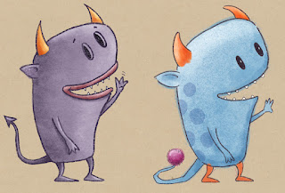
Declan, the protagonist in the story, originally had a look like this:
He was a monster with some edge, yet not too scary. The dummy that sold the book was done with this version.
After some discussion with my editor and art director they asked me if I would consider some changes. Absolutely. I like to think I am pretty open to change especially to make a better product. The way I figure it, they want to sell as many books as I do, they are the experts, and as long as the character is not compromised, why not?
So they asked if we could see some different versions of the eyes.
And lose the lips.
And less pointy horns.
And maybe a puff ball for a tail.
by Kevan Atteberry
When I wrote BUNNIES!!! on a cold but inspired late fall day in December 2012, I thought it was perfect. All 44 or 45 words of it. I couldn’t imagine how there could or would be any edits or revision. My critique group loved it but felt it needed some minor tweaks. I changed a few words for impact and added a word or two to improve the pacing. Then I was certain it was perfect. I dummied it and since I was in-between agents used it to get my amazing agent. She had interests from several publishers and sold it promptly after I signed with her in a two-book deal.
At 48 words I didn’t expect much in revision requests from my editor, and indeed, there was only one—the addition of a single word. It was a great edit and it really completed the story. So, just like that, revisions were complete. Unless you are the illustrator of the book, too.
It is not necessarily called revision, but illustrators face the same fluid scrutiny to their work as writers. They are called art edits. Though the text for BUNNIES!!! was easily and brilliantly revised, the art edits would be much more involved. It ranged from the look of the main character to the background palette to the page layouts.
Declan, the protagonist in the story, originally had a look like this:
After some discussion with my editor and art director they asked me if I would consider some changes. Absolutely. I like to think I am pretty open to change especially to make a better product. The way I figure it, they want to sell as many books as I do, they are the experts, and as long as the character is not compromised, why not?
So they asked if we could see some different versions of the eyes.
And lose the lips.
And less pointy horns.
And maybe a puff ball for a tail.
Another area there was revision was the background palette. Most notably was changing the sky from blue to more of an aqua. I love this. I tend to be more pragmatic in my coloring and would probably have not thought of, let alone tried this. But it really works.
Finally, there were page layouts. The changes they suggested here ended up with me creating an extra 6 illustrations but I think it really worked well. We went from two pages, each with one illustration to series of 4 illustrations to show Declan looking for the bunnies that were just there a minute ago.

This helped dramatically with the pacing of the story. Especially since this particular situation occurs three times in the book. More work, yes, but a much better story and mood setting experience.
There were a lot of other little things, like having his horns droop the sadder he got, etc. In the end, all revision is for the good of the book and the experience of the reader. I am happy with what my editor and my art director got me to rethink and come around to. I think BUNNIES!!! is a much better book because of it.
Love getting an author/illustrator perspective! And something that stands out to me is how big an impact adding two more images of Declan had on the escalating tension. Too often when I am attempting to add tension to the middle of the story I just add a hot mess of confusion. Today I'm going to attempt to do it simply and elegantly, as you have illustrated here.
Thank you Kevan!

|
|


No comments :
Post a Comment